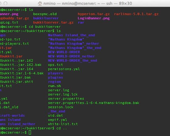
On one site I had an issue where images of various (large) size were being posted by the user, causing the selected theme to display the image over/under other parts of the theme, such as sidebar widgets.
To resolve this issue, I simply opened up my favorite editor, (nano), and added the following CSS to the stylesheet, (style.css):
#content img{ width: 100% !important; height: auto; }
This instruction reduces large images to a maximum width of 100% of the content area, (max-width: 100%) and retains the proper aspect ratio, (height: auto;). I’ve also used this same strategy when dealing with remote-images on forums and other sites where the users can link their own image hosted on external servers.It helps to keep the site(s) uniform and clean without needing to train a user and/or force them to maintain several versions of their image(s).
This process can be applied to any website or CMS that allows you to add custom CSS is the layout or theme.
